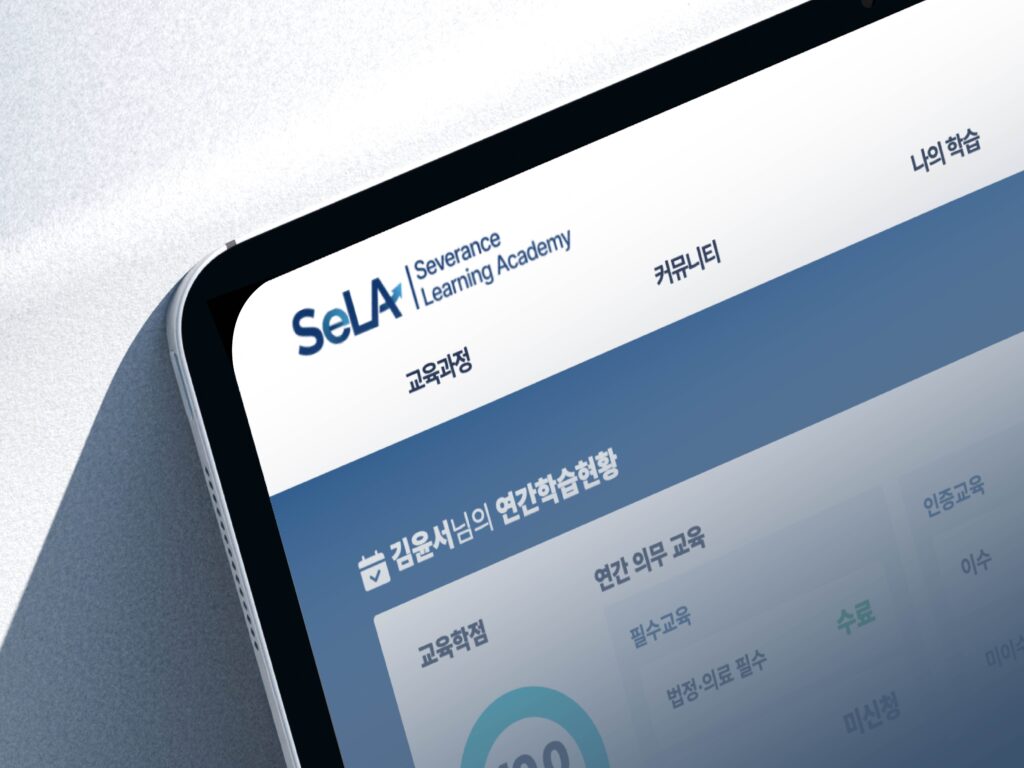
SeLA Brand Identity Design
Designed the official logo and icon set for Severance Learning Academy, an internal learning platform. The visual identity emphasizes continuous learning and growth, reflecting the platform’s mission to empower employees through education.
Time Line
Dec 2024 – Feb 2025
Logo Design Goals & Concept
Goal: Develop a brand identity that visualizes learning as both a moment of pause and a path of growth. The design encourages reflection before moving forward.
Keywords: Pause, Reflection, Growth, Direction, Continuity
Concept: Inspired by the biblical word Selah, the logo highlights the balance between stillness and progress in the learning journey.
The arrow integrated into the “A” represents direction and progress, symbolizing the continuous journey of growth and moving forward.
The rounded “e” represents a pause — a soft, circular form that symbolizes taking time to reflect and let knowledge settle.
Icon Design Concept
In addition to the logo, I created a set of 8 icons for Severance Club activities.
Together, the icons strengthen the sense of belonging and active participation within the learning community.
Each icon was designed with a consistent style to align with the academy’s visual identity.